My Final Designs- hurrah!!

The portrait posters could be displayed at bus stops or on billboards which is why they are in this format. For the image above i used a different statistic again to encourage people to register to donate their organs, quick but strong messages.
The final red and black poster. I decided on the Berthold Akzidenz Grotesk font following more advice from my friend in graphic design as it has more of a powerful impact.
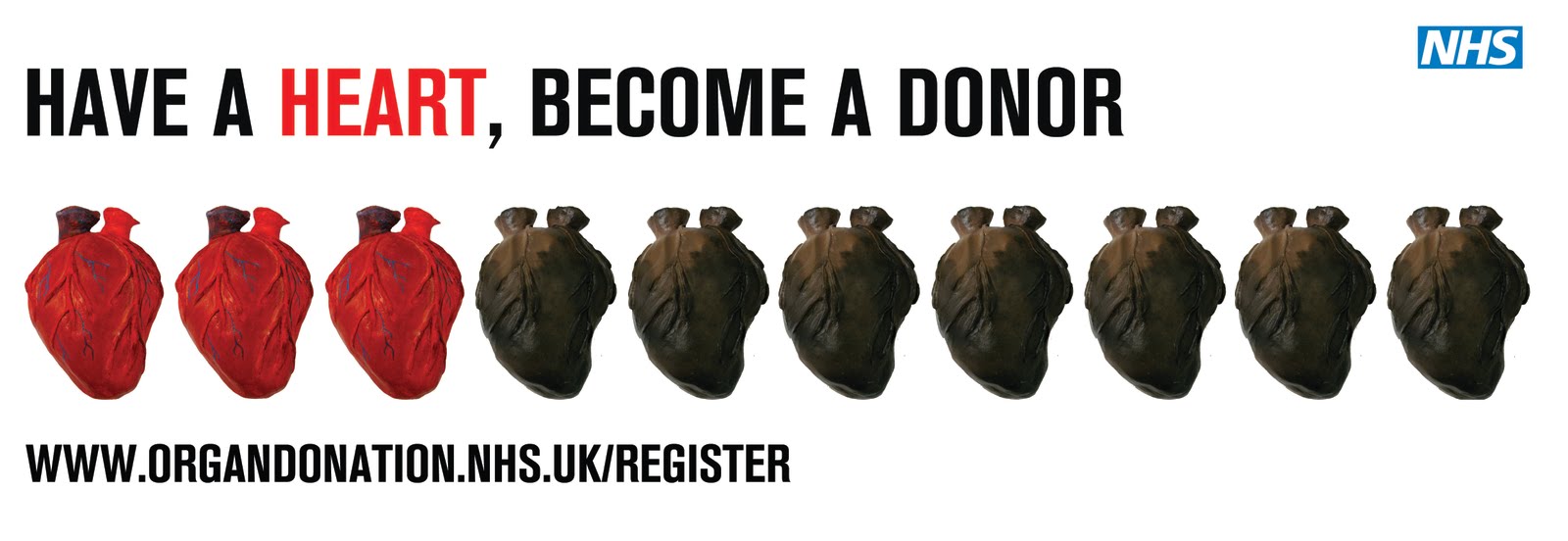
The banner is just a simplified version of the main poster which allows it to be used in different locations such as in a tube carriage on the London Underground.

I picked this text for the broken heart because 'donate when you die' seemed a bit harsh as i am trying to promote the idea of giving a gift which is especially what i tried to do with this poster.
Instead of having the text to the side of the image i aligned it underneath, again to make the image the most powerful aspect and to change it into more of a poster format, and add the tagline.
To encourage people to donate their eyes, i decided to have the statistic of how many people have recieved the gift of sight in the last year or so.


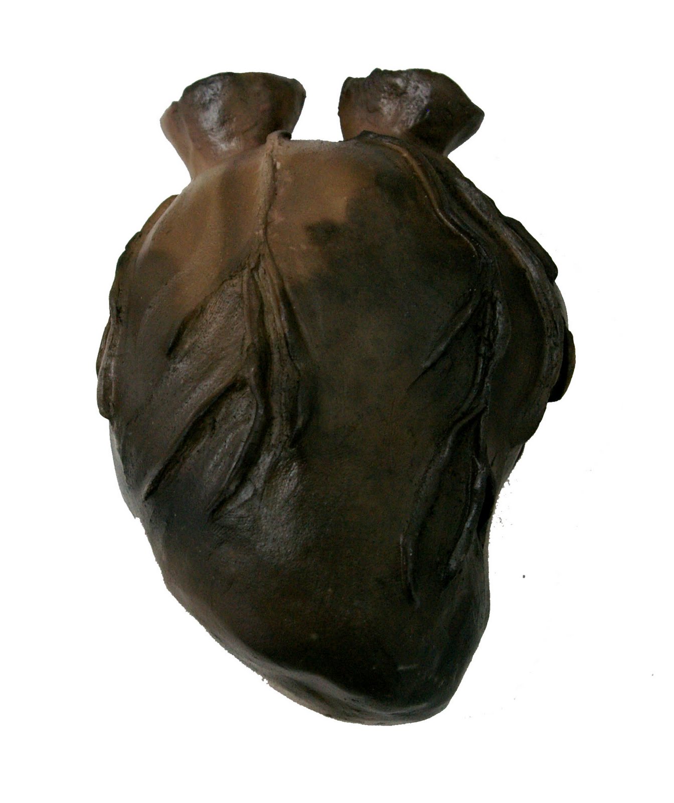
The Mixed hearts poster precious hearts; 'healthy' heart, porcelin heart, chrome/metalic heart and the wasted hearts; broken heart, rusting heart, eroding heart, mixed clay heart, burnt heart, squashed heart and one which has the message of how to sign up on the organ donation register.


After a bit of tweeking with layouts and things, i have finished and decided upon my final 7 posters which i am going to print at university tomorrow. Scary, but glad i've finished them in time!

Mixed Hearts Poster

Two variations with the same layout, just changing the size of the font to see if it changes the effect. I feel this layout is the most successful. The statistic of 3 out of 10 people donating isn't as strong with this one as all the precious and wasted hearts are different and it isnt as obvious that they are split. I still like it though.
Below i think the text is too bunched up together and too close to the images considering it is supposed to be an A2 or A1 size poster, not a banner.
Again, i like the white space between the text and the image but as with the other poster in certain locations the images could be hidden by things like trains or trees.

Although the mixed hearts on a page don't have quite the same impact or message that the red and black hearts have, i still think the poster looks quite good with the range of hearts i have made. I have just been playing around with the layout of this poster today.

Broken Heart Poster

Playing around with different text, fonts and layouts. I feel the one below would make people question what the subject is about and therefore look it up, although it would maybe be better if the message was clear from the offset.
With the text below rather than to the side:


More Trial and Error with the posters!

I think the poster works better with the white space between the images of the hearts and the text at the bottom to allow the viewer enough time to digest the message. I have also come up with a tagline for the project "Have a heart, become a donor" which i think works quite well for the campaign. The hint of red in the text was a suggestion from my friend who is studying graphic design which i was very grateful for as i feel this pulls the image and text together.
This poster has been condensed so it could be displayed in a tube carriage for example.


I like space between the text and image but if this poster were on the tube you would see the text before the image and i think it shoudl be the other way around. The text should accompany the image rather than the image accompanying the text.


I have just been focussing on the red and black hearts poster at the moment, trying to get it to look right with the text and image working together.

Initial Poster Ideas

I am currently trying different layouts for the broken heart approach. I like the image on one side with the text but im not sure about aligning the text to the centre.
Simplifying the 3 precious and 7 wasted hearts idea using only two hearts; my 'healthy' precious heart and the 'wasted' smoke fired heart. I think it is quite a powerful message and you instantly see three and seven. I have used Arial as this is NHS approved but i'm not sure if it goes well with the images.
I tried placing the text on the image with the idea of making them leaflets in the heart shape but i'm not sure if it is clear and legible enough.
I don't think the text and image work very well together, in terms of composition, i might have to have a play around with that.
I'm not 100% sure if the message is clear on this one, i.e- 'if the answer is yes' refers to the question on the heart and although legible not sure if it stands out enough.
I used Algerian font, not sure if it works too well with the message, i just liked the look of it when i was deciding.

So i decided the 3D hearts i have made won't be good enough for the organ donation campaign on their own so i have used the photographs i took of them last week and started to put them into posters. First attempts, not that great but i'm working on it!

And the rest......

The result of the photolythography process. I'm quite pleased that the text is so clear and how striking the image is when the background is removed.
The metalic heart was made by spray painting it with a chrome effect paint. Very messy but i'm quite pleased with it.
Painting the clear glaze on to my porcelin heart. Obviously it is green before it drys so you know where you have painted.
My precious porcelin heart! I simplified it to add to the smoothness and felt it looks more perfect without bits added on. The glaze did crack slightly but i quite like the effect.
Painted with a red glaze and then fired. I used studio white clay for this one as apposed to St Thomas clay and found it a lot harder to mould into the shape i wanted, as you can see it is a bit of an awkward shape.
The tiny heart i made using up the rest of the clay i had as it was starting to dry out too much to put back in the clay bin.

The mixed clay heart after firing, which didn't crack as much as i hoped it would!!

Borrowing Jo's suitcase to present them for the moment.

The rest of my hearts that i have been working on over the last few weeks at various intervals between my necklaces and professional practice briefs.

Firing my heart- scary!

The vases and heart ready to go.


It needs a lot of newspaper and sawdust.
Just starting.
Half way through; the smoke is what blackens the clay not the fire.
The fire dying down.
After the smoke has cleared, you can just see the heart right in the middle.


I wanted one of my hearts to have the effect of looking burnt, so with the help of Ralph and Mo from cermaics i was able to fire one of my ceramic hearts (after it had been fired in the kiln) in a metal bin. Very scary and smokey but i'm really pleased with how it turned out!