
 I think the poster works better with the white space between the images of the hearts and the text at the bottom to allow the viewer enough time to digest the message. I have also come up with a tagline for the project "Have a heart, become a donor" which i think works quite well for the campaign. The hint of red in the text was a suggestion from my friend who is studying graphic design which i was very grateful for as i feel this pulls the image and text together.
 This poster has been condensed so it could be displayed in a tube carriage for example.
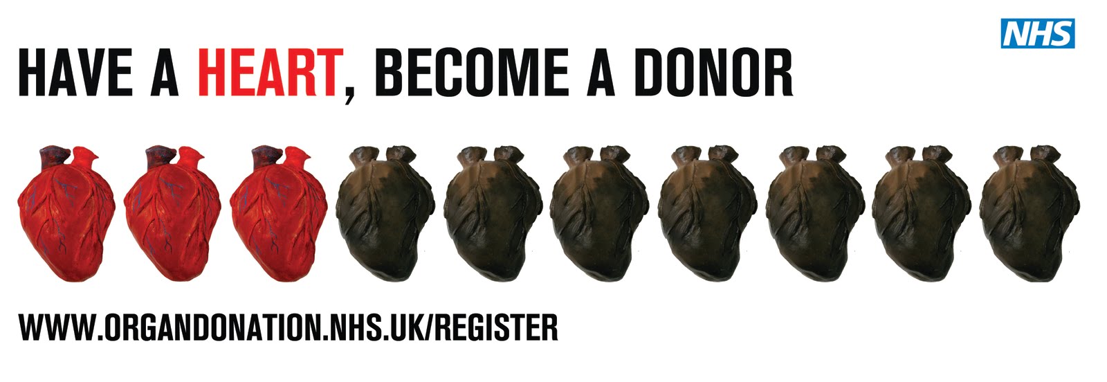

I like space between the text and image but if this poster were on the tube you would see the text before the image and i think it shoudl be the other way around. The text should accompany the image rather than the image accompanying the text.

I have just been focussing on the red and black hearts poster at the moment, trying to get it to look right with the text and image working together.

No comments:
Post a Comment