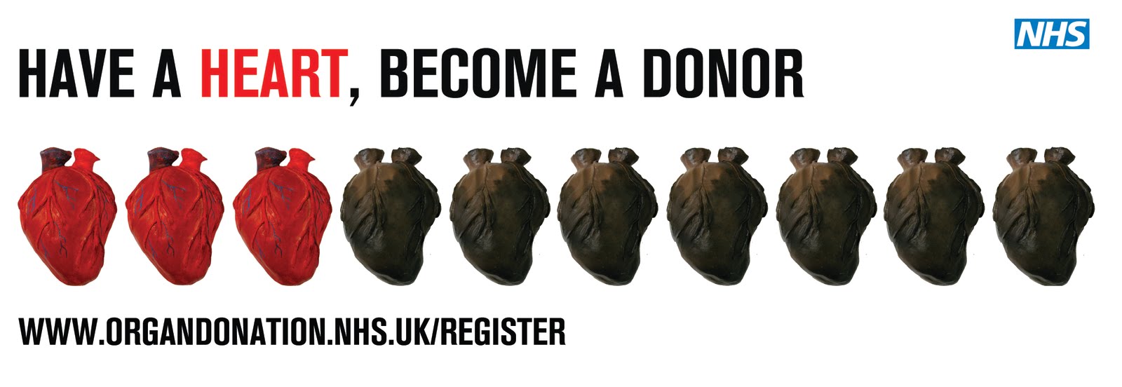
Two variations with the same layout, just changing the size of the font to see if it changes the effect. I feel this layout is the most successful. The statistic of 3 out of 10 people donating isn't as strong with this one as all the precious and wasted hearts are different and it isnt as obvious that they are split. I still like it though.
 Below i think the text is too bunched up together and too close to the images considering it is supposed to be an A2 or A1 size poster, not a banner.
 Again, i like the white space between the text and the image but as with the other poster in certain locations the images could be hidden by things like trains or trees.
Although the mixed hearts on a page don't have quite the same impact or message that the red and black hearts have, i still think the poster looks quite good with the range of hearts i have made. I have just been playing around with the layout of this poster today.